Project: Pennypost

Stakeholders Interviews
By drafting scripts for interviewing key stakeholders for this project, both internal and external, we were able to gather insights about their goals. This helped priotirize features and define key performance indicators (KPIs)
KPIs help inform design decisions along the way and measure results of the UX efforts

The Brief
Redesign beta application for Pennypost to offer users the ability to create real postcards in three easy steps on their cell phones. After completion new application will go live.
Through 3 rounds of usability testing stakeholders would like to analyse and identify purchasing dropoffs, design flaws, and any other possible processing errors.
By creating a new and streamlined process, customers will be able to create, design, look up addresses, and purchase postcards to be delivered to family and friends.
UX Methods used:
Research/Interview
Comparative/Competative Analysis
Affinity diagrams
Persona creation
Task Analysis
User Journey Map
Site Map
Userflow
3 Rounds of usability testing in Invision
Systems used:
Omnigraffle
Sketch
Adobe Photoshop
Adobe Illustrator
Google Slides presentation
Invision
Content Audit:
By listing all content available on a website and phone app. We were able to develop a strategy and make a list of deliverables that came in handy at various stages of the project. It helped us see the big picture, define the content strategy and check the details of each step

Importance
of in-depth
Analysis
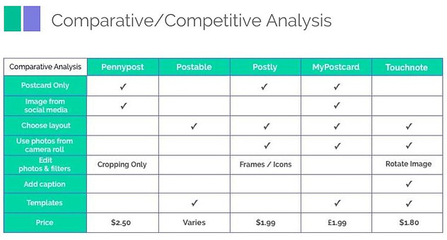
With a comprehensive analysis of our competitor products it helped map out their existing features in a comparable way. This helped our team understand industry standards and identify opportunities to innovate in a given area
Neilson's Heuristic Traits followed:
#4 Consistency and standards
Users should not have to wonder whether different words, situations, or actions mean the same thing. Follow platform conventions.
Affinity Diagram:
Per the feedback from all the surveys and interviews, content audit, stakeholder feedback, initial user testing, we were able to determine the main pain points.
Neilson's Heuristic Trait followed:
#8 Aesthetic and minimalist design.
Users wanted to keep within the Pennypost platform with a familar page and minimalistic design.
Proto Persona: Katie
From the pain points collected, wants and desires, and also the layout of the Affinity Diagram the team was able to create 2 personas and 2 archtypes. The main persona is the target user for Pennypost
Neilson's Heuristic Trait followed:
#4 Match between system and the real world
The system should speak the users' language, with words, phrases and concepts familiar to the user, rather than system-oriented terms. Follow real-world conventions, making information appear in a natural and logical order. Here the persona is created for Pennypost keeping the traits in mind. The end product will speak her language with familiar key words and phrases.


By using this diagram it helps to explores the multiple (sometimes invisible) steps taken by consumers as they engage with the service. Allows designers to frame the consumer’s motivations and needs in each step of the journey, creating design solutions that are appropriate for each
.
Neilson's Heuristic Traits followed:
#1 Visibility of system status
The system should always keep users informed about what is going on, through appropriate feedback within reasonable time.
Importance of User Journey Mapping:
Neilson's Heuristic Traits followed:
#7 Flexibility and efficiency of use
Make the design flexible, to deal with a variety of situations. Some users are experts, some are novices, so they won’t all have the same abilities or needs. Do all your users need to see all the possible options, or can you hide some away in most cases? If you know that certain users perform one task often, while different users usually do another task, perhaps you can tailor your system for each group

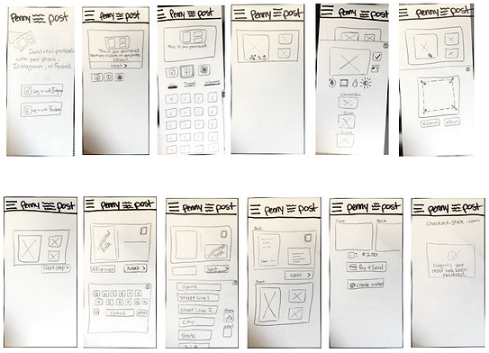
Using in-person and online interviews, along with research analysis of the current beta mobile application, the team was able to identify the main redesign needs/wants. From there we did 4 rounds of design Charrettes and the team came up with a redesign layout for usability test.
Neilson's Heuristic Traits followed:
#1 Visibility of system status
#6 Recognition rather than recall
#8 Aesthetic and minimalist design
After user testing we redesigned and made many iterations to retest. As the teams visual designer I gathered the highlights per the usability testing and altered the screens according to the feedback.
Findings: Users wanted minimalistic design with breadcrumbs. The components needed were condensed and kept the users informed about what is going on, through appropriate feedback with a reasonable time frame.
By minimizing the user's memory load by making objects, actions, and options easiliy visible. And finally the progression through the steps were created to be intuitive.
Design Charrette
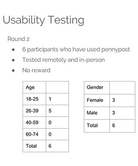
Importance of thorough usability testing:
Through evaluation a product can be used by specified users to achieve specified goals with effectiveness, efficiency, and satisfaction in a specified context of use.
Neilson's Heuristic Traits followed:
#2 Match Between System and Real World
The system should speak the users' language, with words, phrases and concepts familiar to the user, rather than system-oriented terms. Follow real-world conventions, making information appear in a natural and logical order

Round 1 Highlights
-
"Current $0 next postcard will be $2.50" confusion
-
Users want camera roll access
-
Users would like photo edits and effects options
-
"add contact" not a clear call to action for users to move forward into the next step
-
Hover feature blocks first row of pictures
-
Users want to edit postcard background
-
Users like the tutorial and want to view it again (place in the hamburger menu)
-
Users want to edit the text and layout


Round 2 Highlights
-
Main page was confusing for logins to FB, Instagram
-
Users overwhelmingly clicked on the postcard itself to add a message or recipient
-
Users were expecting a 'drag and drop' system to add photos
-
Users want to ask for an address using text messaging and accessing your phones contacts
Round 3 Highlights
-
Some users did not realize pennypost sends physical postcards
-
Users liked to see their progress in breadcrums. No changes recommended keep existing.
-
Users expected that if they could add more recipients they could add more and also edit message on same postcard
-
Users expected a 'drag and drop' feature to add photos
-
Users requested to have travel themes added to the layout


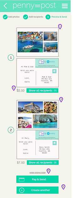
Part of my responsibility was to communicate the rationale of your design decisions to our stakeholders.
Wireframe annotations are important because they give clients clear explanations of the team's design decisions. Annotations are an aide to the understanding. Unless they understand user experience, it’s hard for most clients to see the value of the design without annotations.
Annotations allowed us to explain why our design is effective. This gave insight to our thinking process and allowed stakeholders to understand the design layout better..